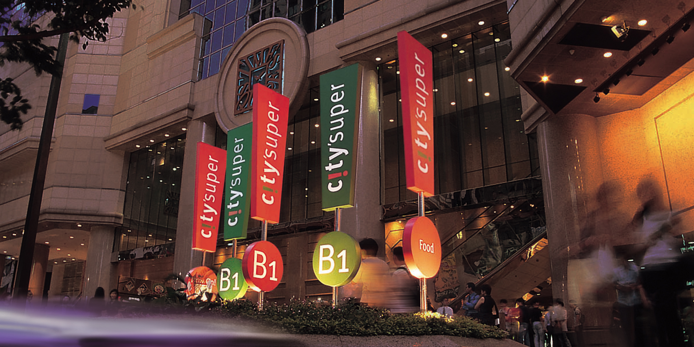
city’super is established with a vision to develop a new way of communication for the younger generation in Hong Kong nowadays. Its brand concept based upon a brand new lifestyle department store is unique to the Hong Kong retail industry. The store targets at customers who are 18 to 30 at age and are design-driven and trend-conscious.
ACDC has created its corporate identity and packaging design, which remains iconic and classic since the city’super first store opened in 1996.
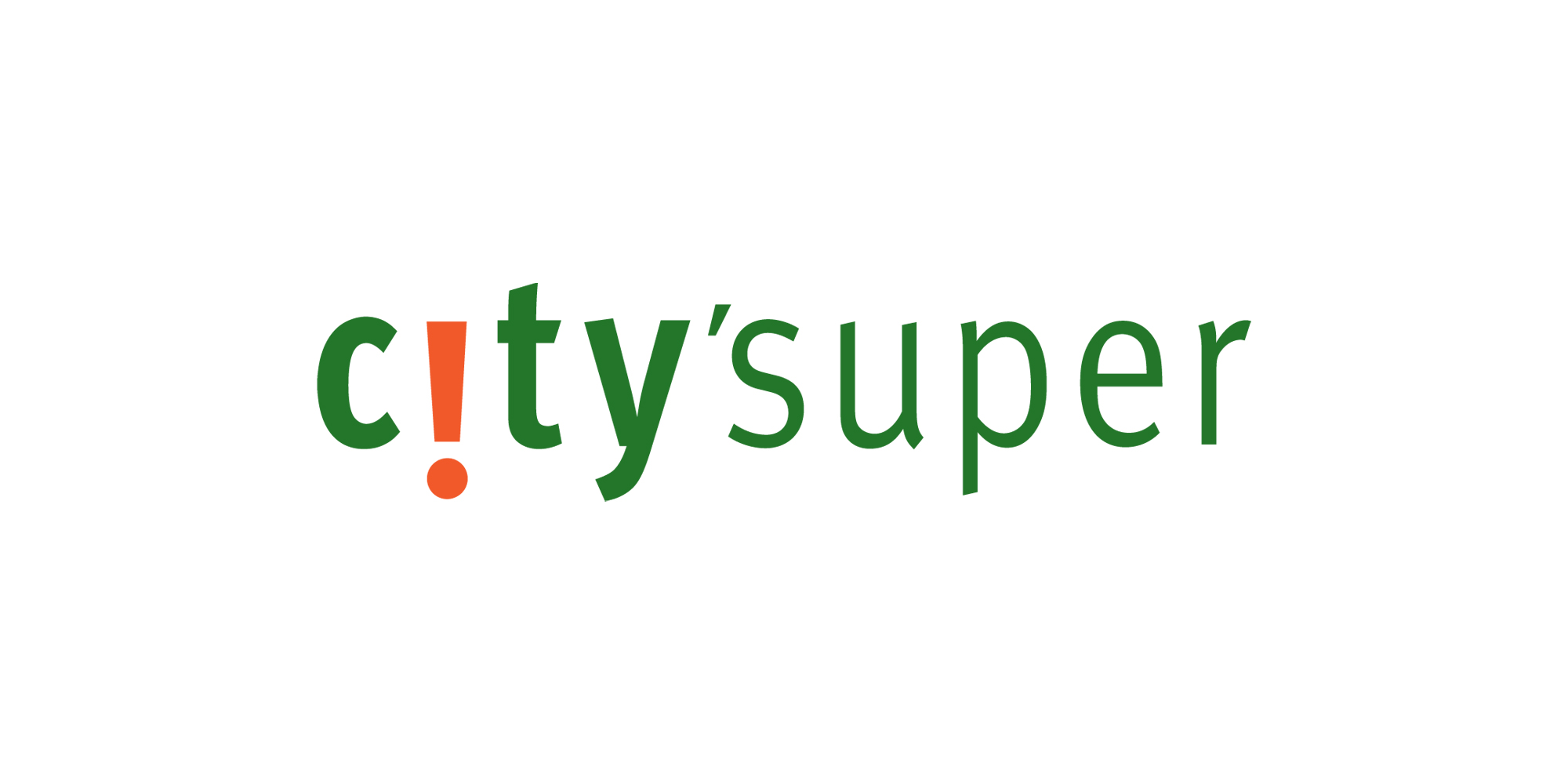
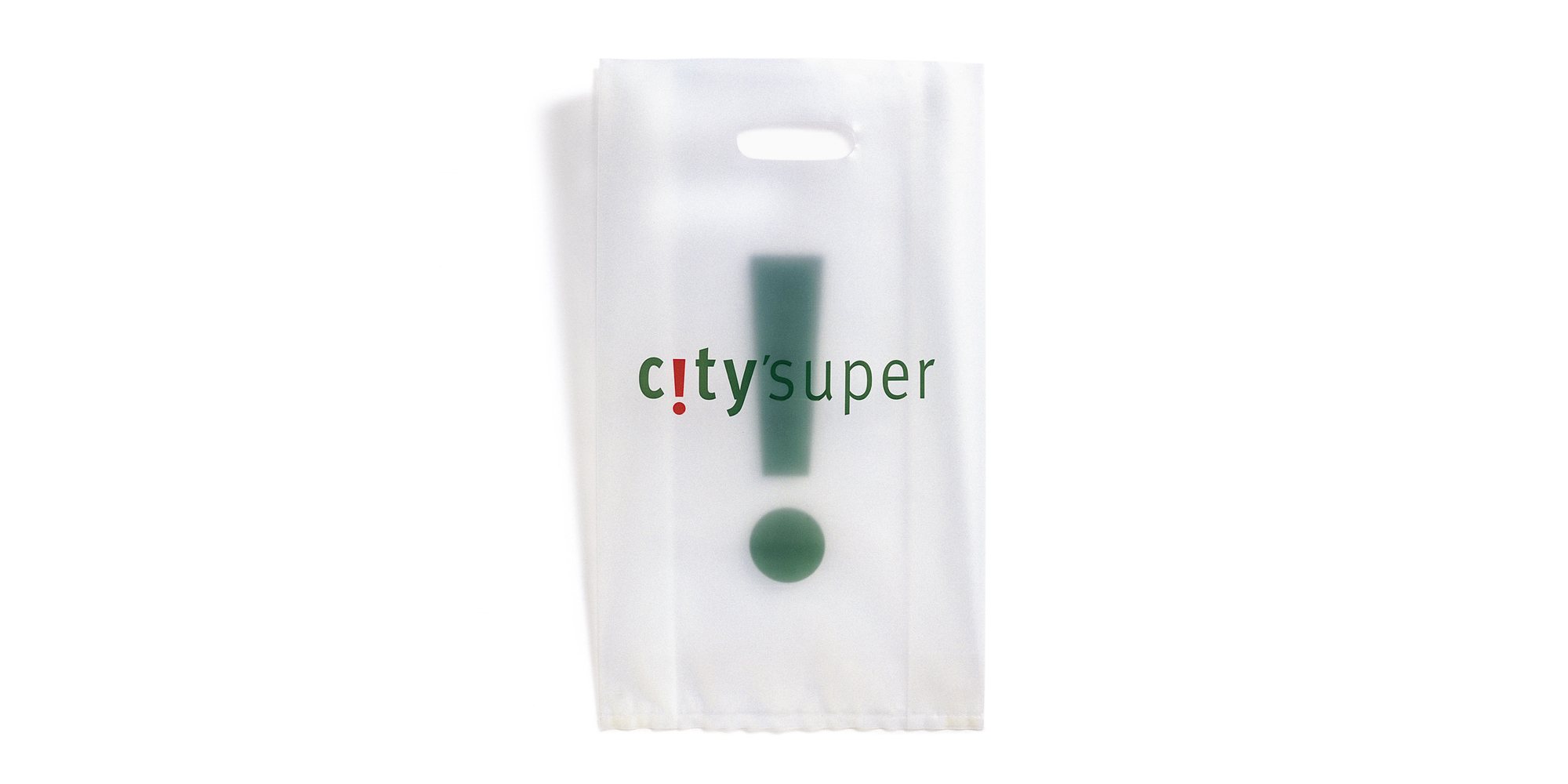
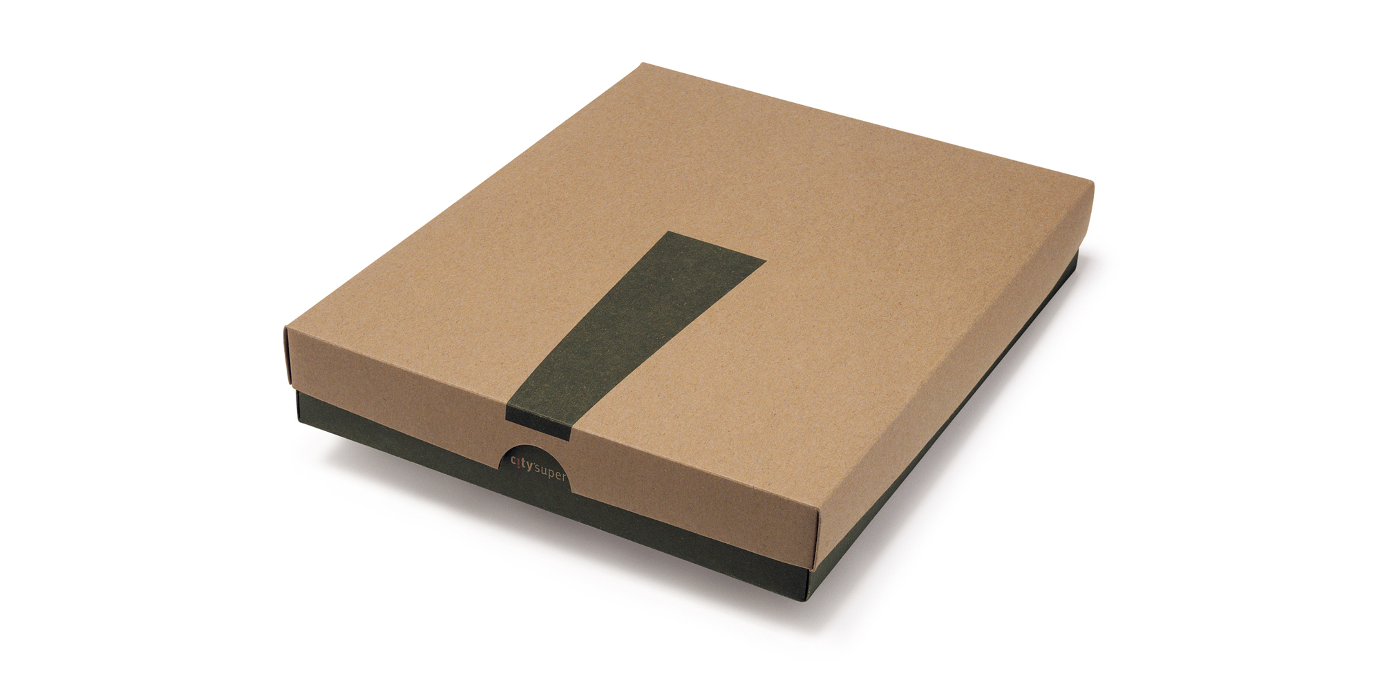
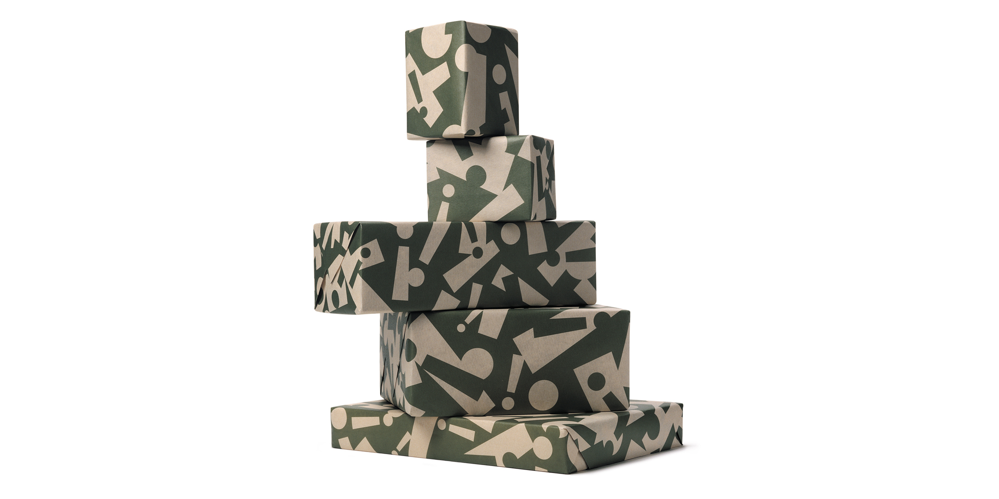
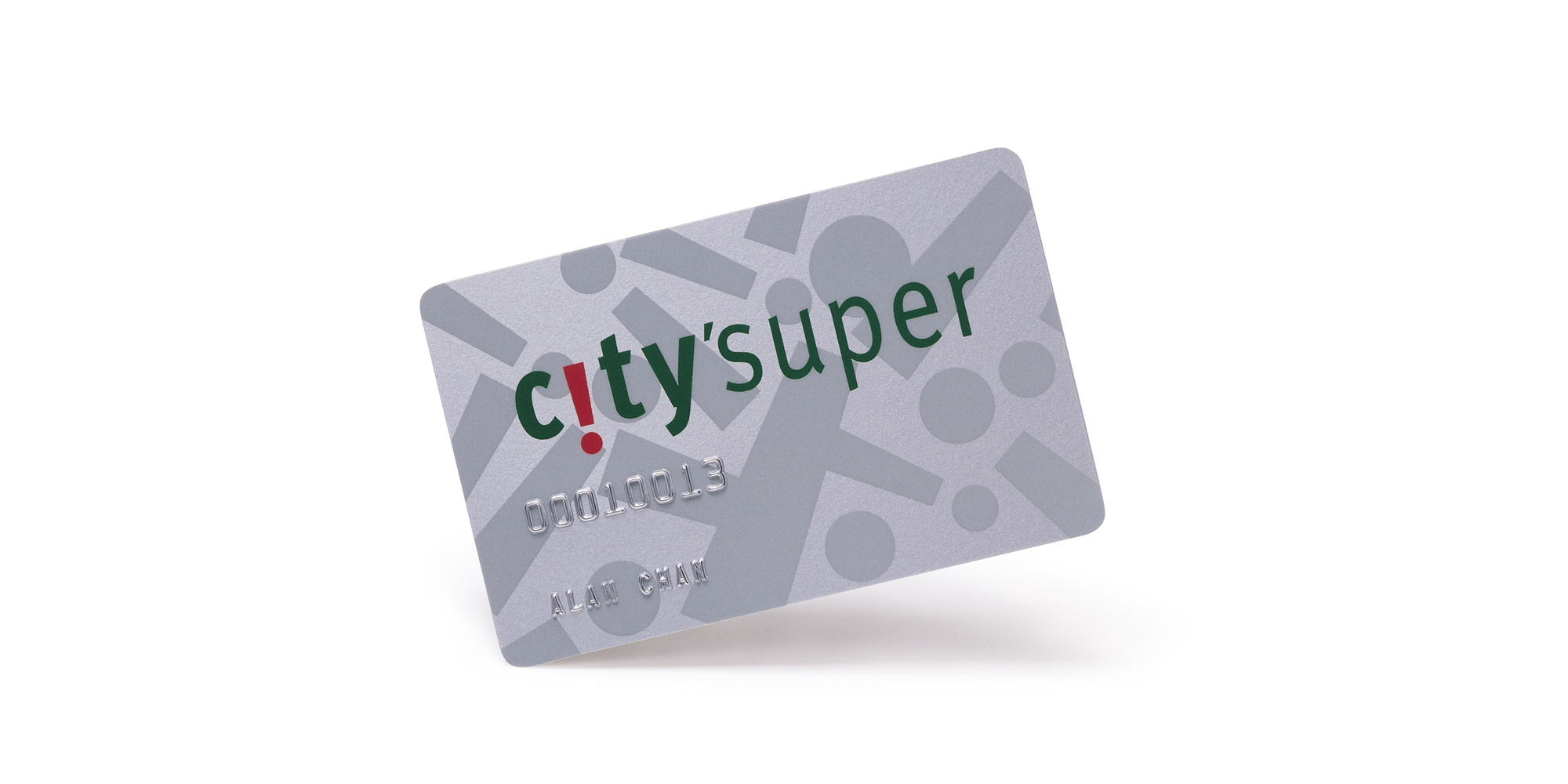
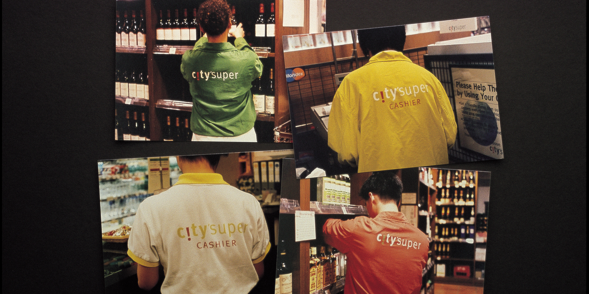
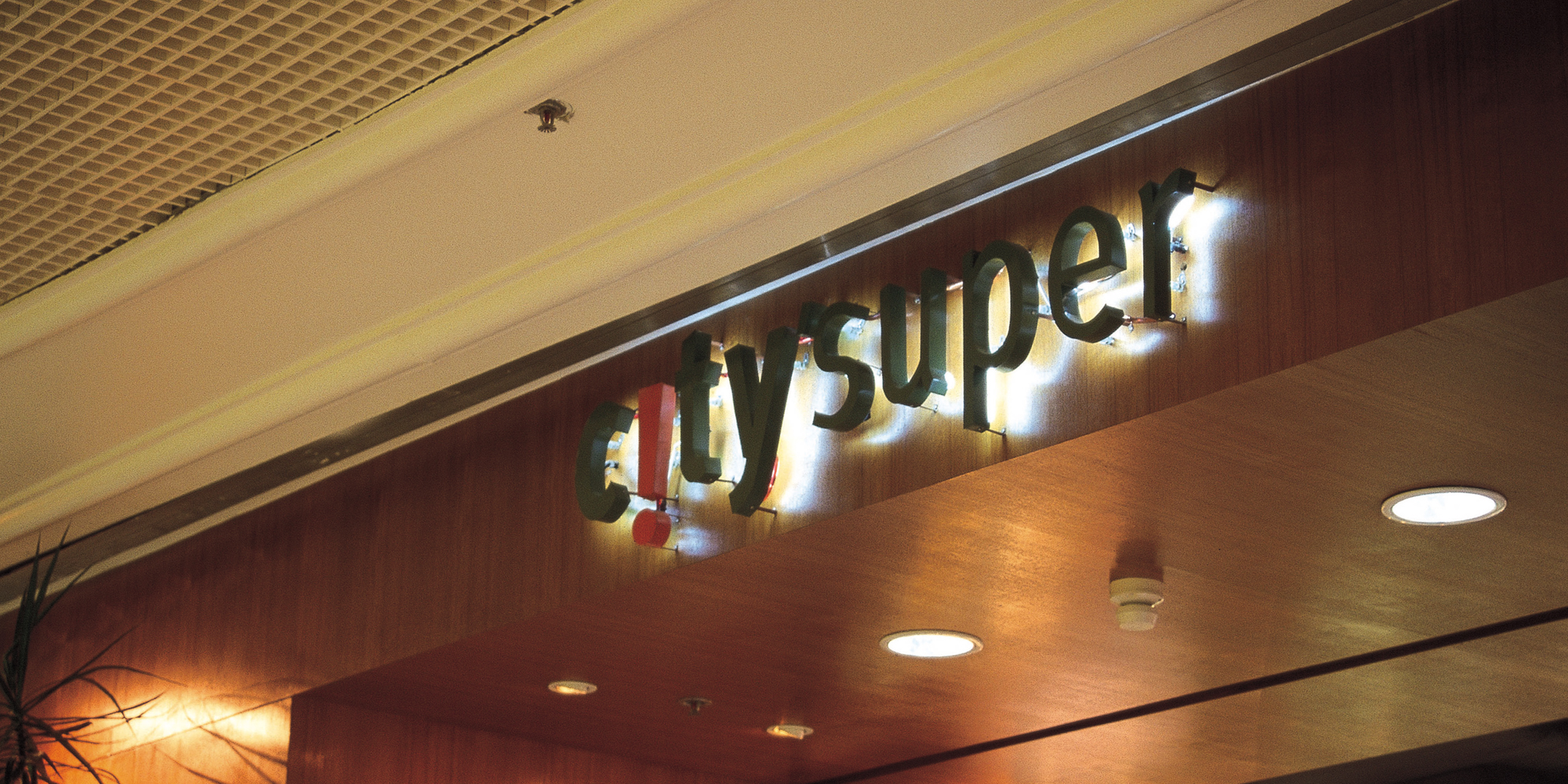
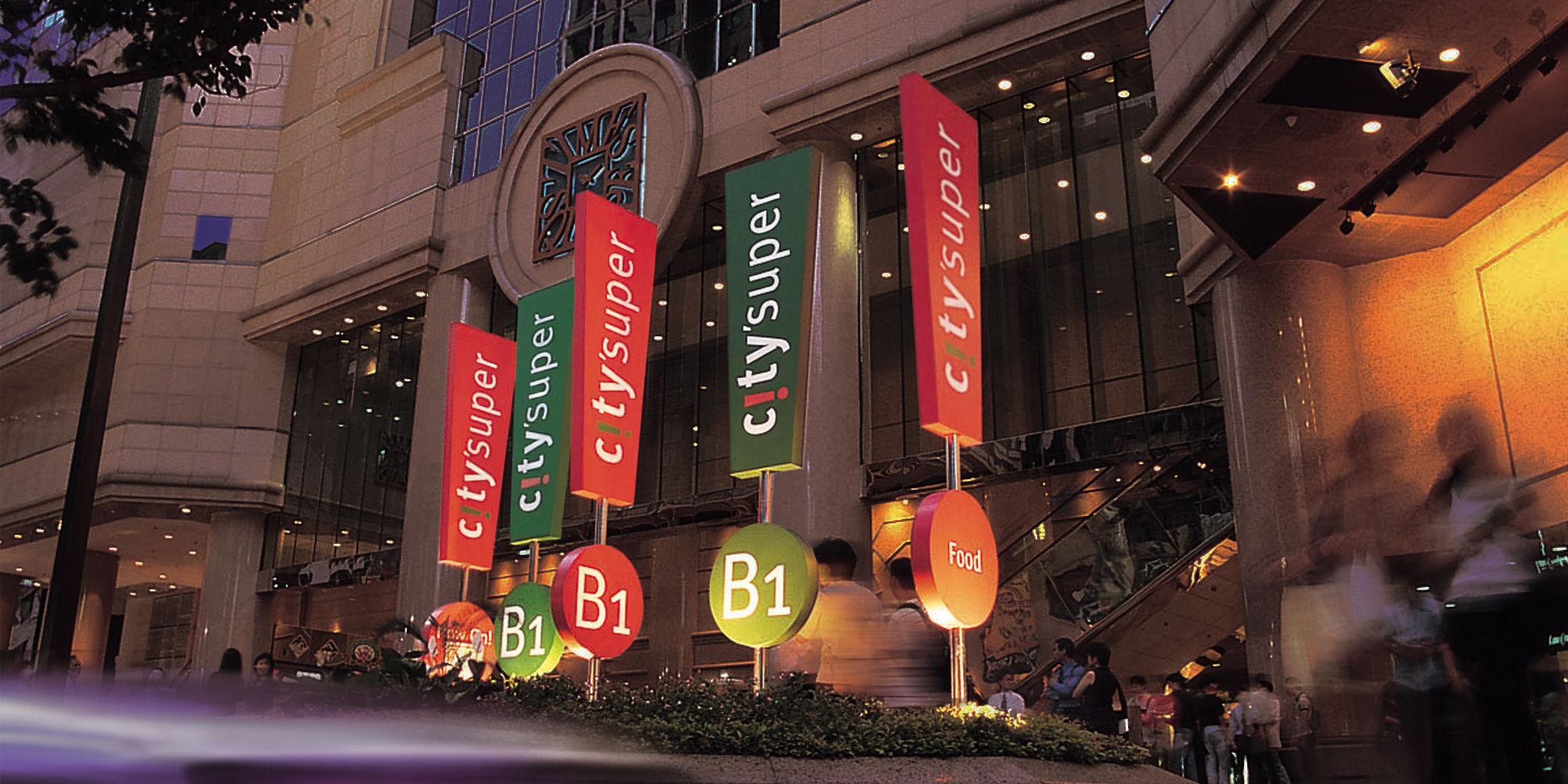
This identity is a simple but stylish and modern presentation. Letters in the lower case are used to project the youthful feeling as well as friendliness.
The focal point of the symbol lies in the upside-down character “I” which forms an exclamation mark, projecting the state of being amazed, excited and overwhelmed by its wide variety of trendy, lifestyle and quality merchandise and services.
The fact that the “!” comes right inside the word “city” symbolizes that city’super is going to bring “exclamations” into this metropolitan city of Hong Kong.
Moreover, the upside-down “I” reflects the attitude of the target customers of the store — they are the young and up-and-coming generation who are adventurous, who wants always to make a statement in their life. Not bounded by traditions, they see things very differently and express it through where they go and what they do. And city’super is a place where they could find their identity.
